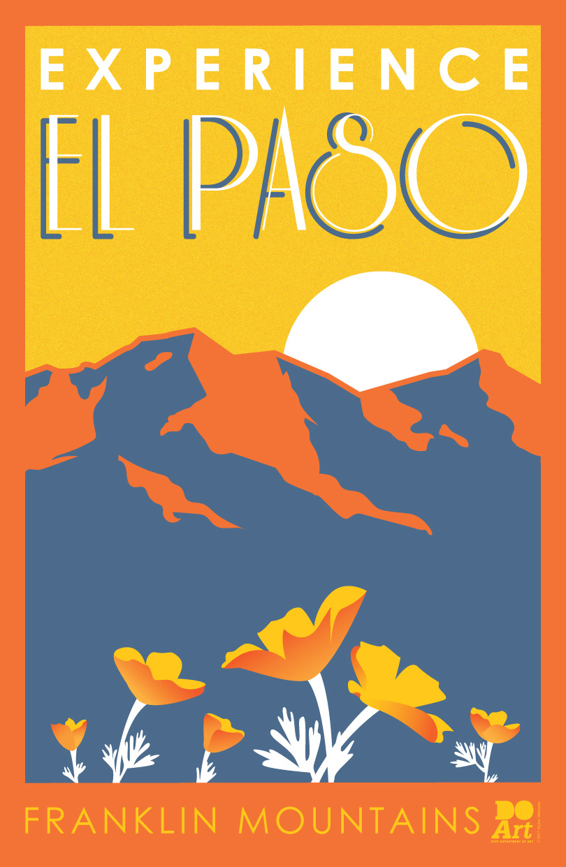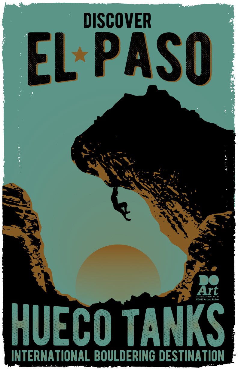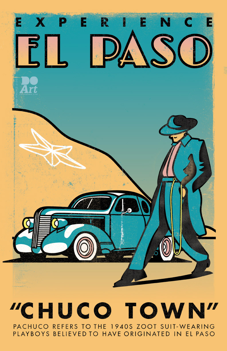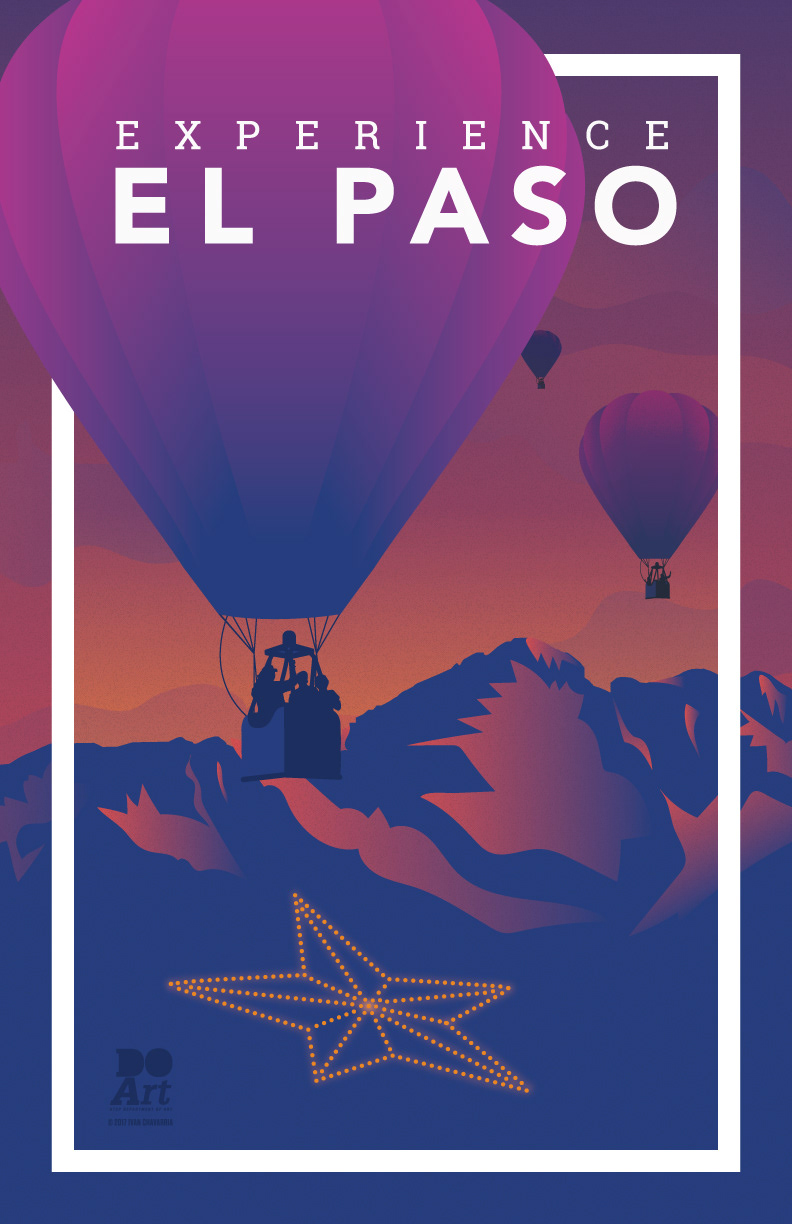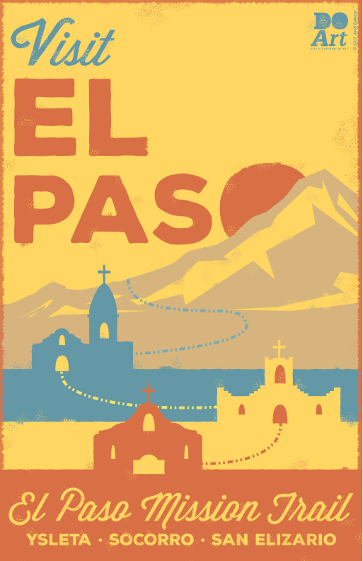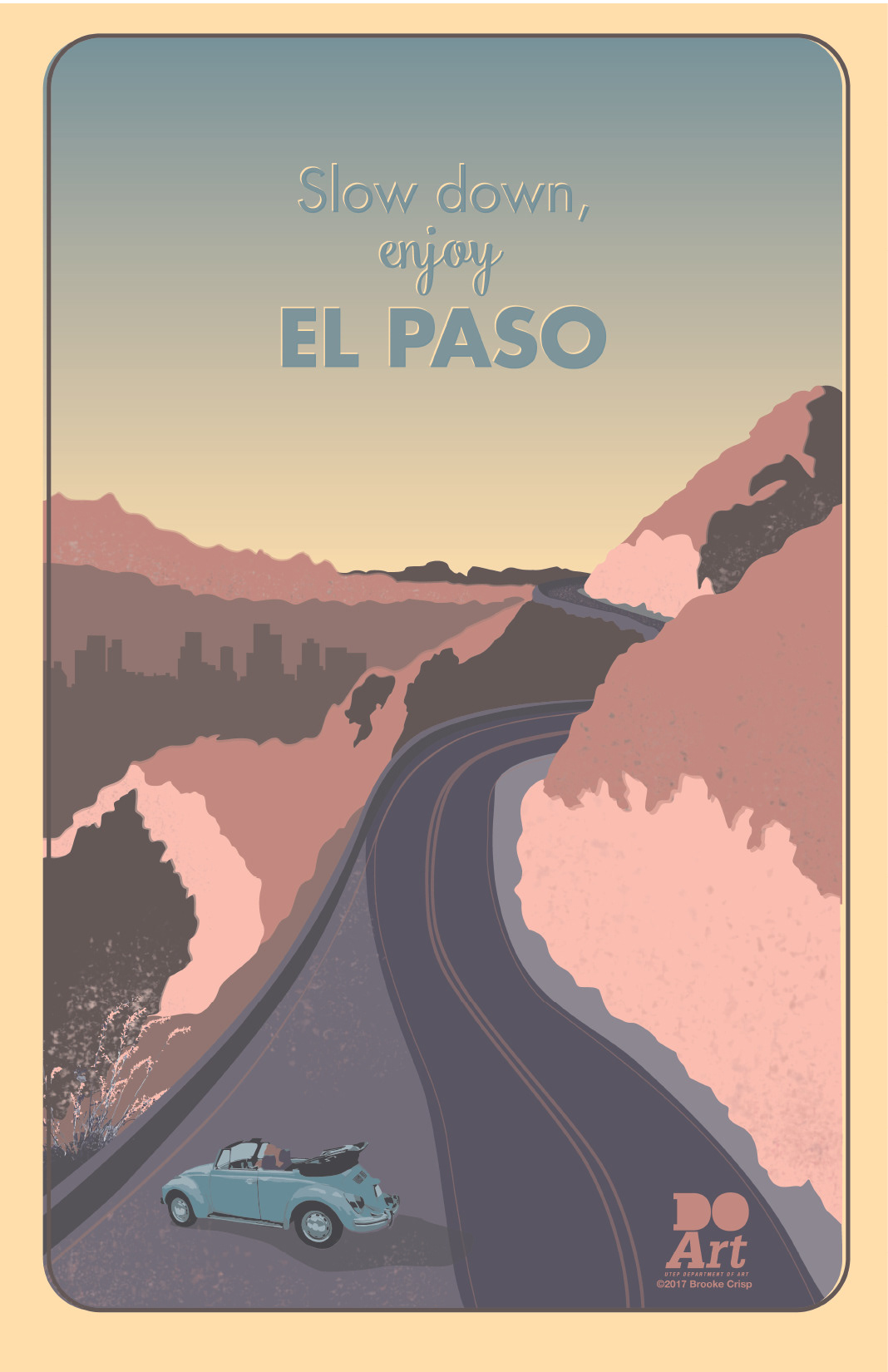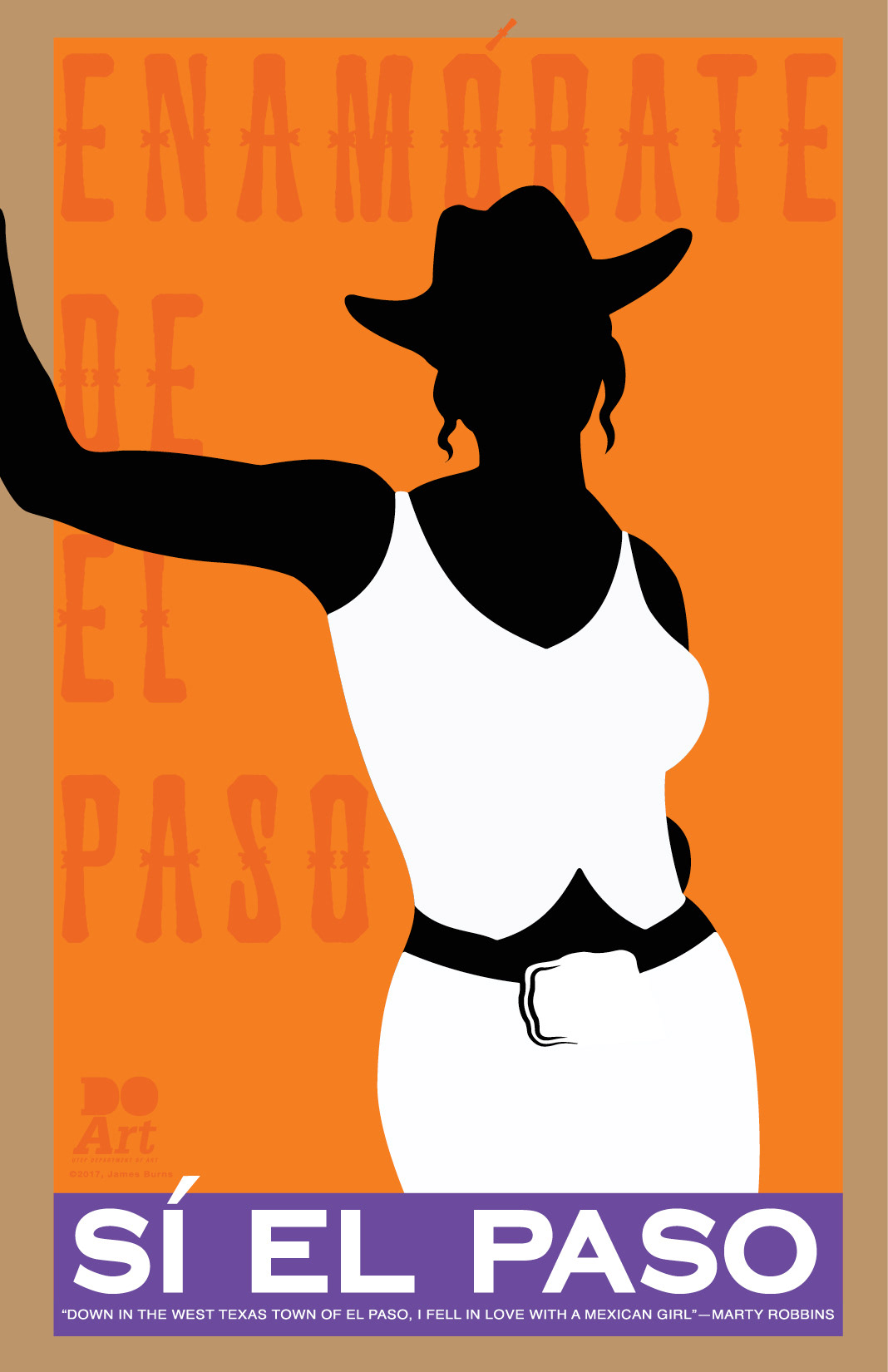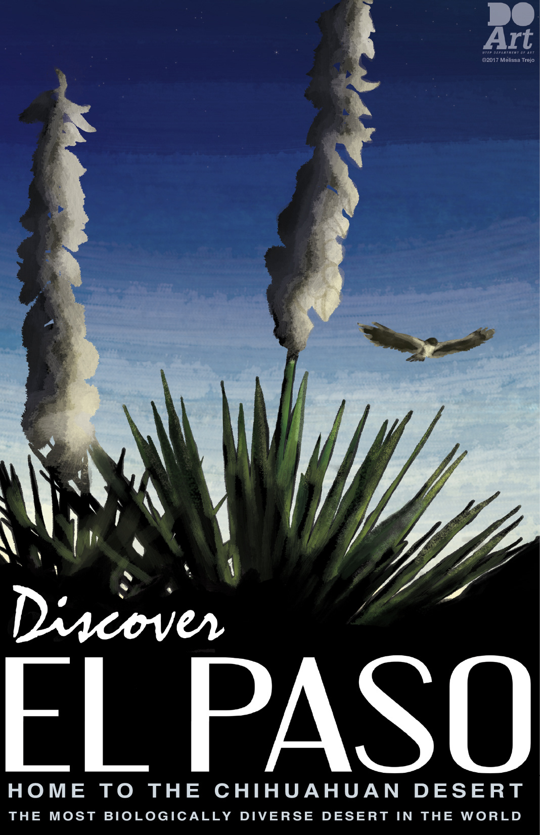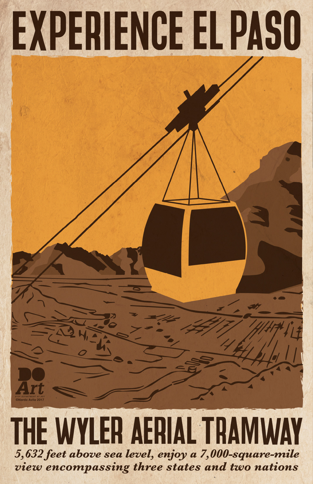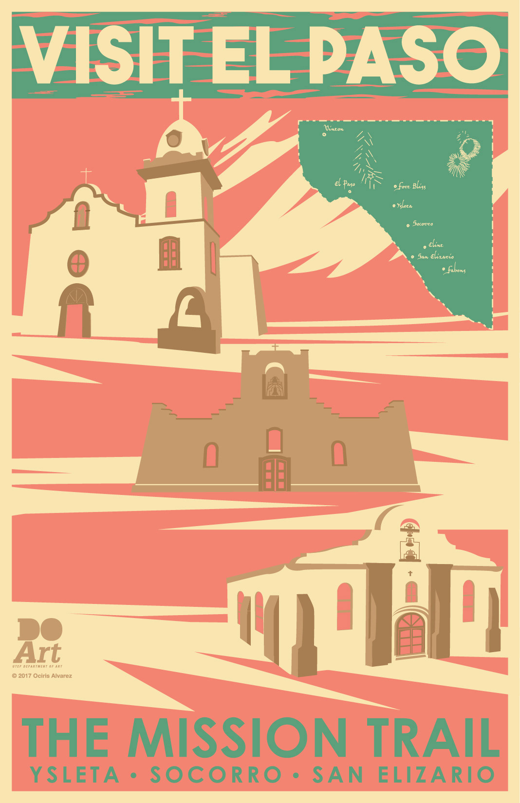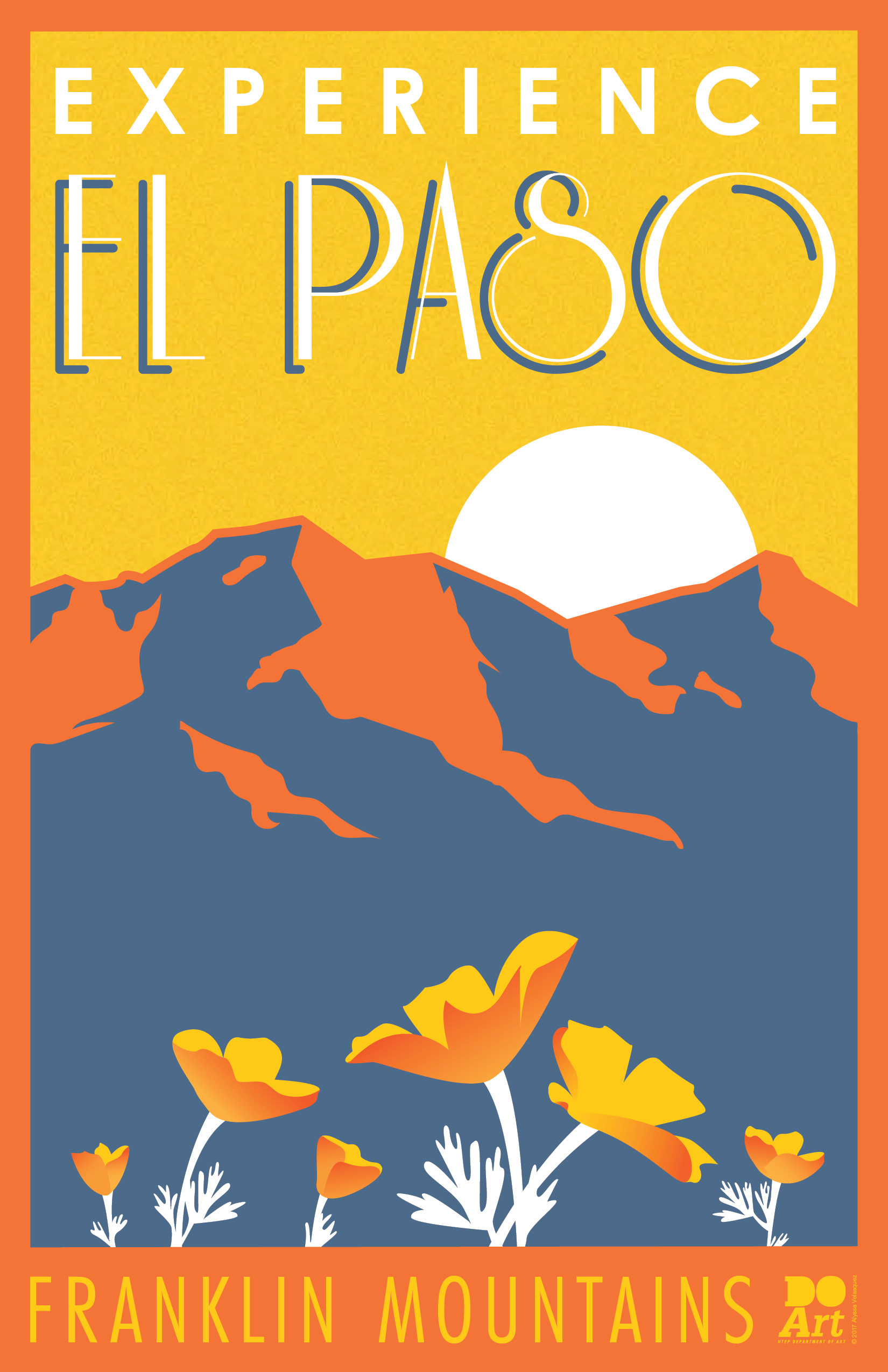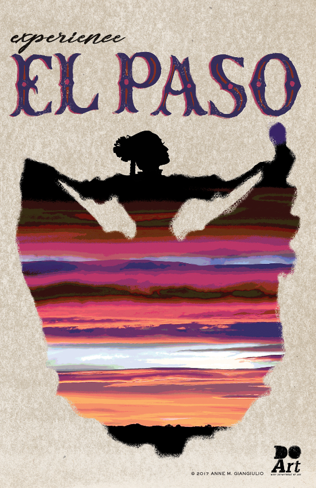

I asked my intermediate-level Graphic Design 4: Typography class students, "As a designer, how would you attract non-El Pasoans to our fair city?" In the then (2017) political climate, "the border" was depicted as a place of lawlessness, insecurity, and ugliness—a place where a “big, beautiful wall” would be a welcome addition. I asked them, "You actually live here—is this how you see it? What is our true reality of life in El Paso? What do you believe are our strengths and points of beauty? This poster is meant to explore this truth, namely our assets, and convey them to those who perhaps only have formed their opinions of the border by what they see on national TV, having never stepped foot here."
As Steven Heller writes in his Daily Heller column in which these posters were featured, "President Trump’s rhetoric and action on immigration has sent shivers down the spine of many documented and undocumented Americans, but none so much as those who live on the U.S.–Mexico border."
The tradition of designing enticing posters to lure people to specific destinations goes way back. The class, which focuses on the history of design, looked at Herbert Matter’s posters for the Swiss National Tourist Office that depict skiers in a virtual winter wonderland.
According to Meggs' History of Graphic Design, “(Matter’s) posters of the 1930s use montage, dynamic scale changes, and an effective integration of typography and illustration.” Matter is just one of many designers to try his hand at the genre of travel/tourism posters. Such posters have been sponsored by tourism offices, but also by airline and railroad transport companies like E. McKnight Kauffer’s for the London Underground, Michael Schwab’s for Amtrak, and even NASA has released an impressive series on space travel in the style of retro posters.
These posters were sold at El Paso's downtown Chalk the Block arts festival with students keeping 100% of the proceeds of their sales.